|
Division Arms Logo Why the Great Horned Owl 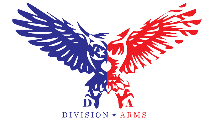 I retired out of the Air Force with 23 years of service under my belt. In 2018 I started a new business, Division Arms LLC, and I wanted to find the perfect logo for it. I wasn't looking for anything too generic or tactical-looking; instead, I wanted something that represented the company, and our values. We also looked to incorporate something from the Air Force that represented flight. After weeks of searching and researching possible logos, I finally stumbled upon the Great Horned Owl - a symbol often associated with courage, strength and knowledge - which seemed like the perfect fit. But there was more to it than just its symbolism; owls were also protectors of family, fearless and decisive in action. I set out to bring this logo to life, the owl is a great representation of Division Arms, we have two main color variations, the Red/Blue (official logo) and the Tan/Olive Drab for our training/edc side I felt good with our choice of logo, since choosing it, we created our patch and it can be seen on most marketing material and t shirts etc.
~Scott~ 08 January 2023 |